Nevada Department of Education
At a glance
As part of my DH110 course (User Experience and Design), I examined and improved upon the current Nevada Department of Education website using a user-centered design approach. I conducted research, carried out contextual inquiries and usability testing, and created personas and empathy maps to understand the users considerably and create a user-centered design project.
ROLE
DATE
SKILLS
TOOLS
UX/UI Designer
Sept 2021 - Dec 2021
Design, Prototyping, Usability Testing, Interviews
Figma
Problem
COVID-19 dramatically changed schooling in the United States, with the need for online schooling, remote learning, and digitized information and resources. The Nevada Department of Education (DOE) oversees the public K-12 education system in Nevada. The website provides all the information on K-12 education for all people from educators to parents and students. The current Nevada Department of Education website is formal, outdated, and cluttered. Good user interface design is crucial for parents, students, educators, and more to access information and resources easily.
Problem Validation
Heuristics Evaluation
I analyzed the usability of the Nevada Department of Education website using Jakob Nielson's 10 Usability Heuristics for User Interface Design. Three main usability concerns emerged as I conducted the evaluation:
The entire website is cluttered and overloaded with information. There is no hierarchy of information and the entire website in general is not user friendly. There are too many tabs with too many drop down options which can confuse users. The website scored a 3 on the severity rating on the aesthetic and minimalist design heuristic.
The website did poorly on the recognition rather than recall heuristic. The search bar does not remember user's previous searches, which makes it difficult for users to remember what they have already looked up and what they have not.
The website scored a 3 on the severity rating for the help and documentation heuristic. The FAQ page is hidden all the way at the bottom of the first menu tab and is not visible.
Find the link to the full documentation of the heuristics evaluation here.
Usability Testing
Given the concerns uncovered from the heuristics evaluation, I conduct a usability test to understand the extent to which the design of the website hinders users' ability to use the website to find information on the Department of Education. The test captured the effectiveness, efficiency, and satisfaction of the Nevada DOE website. The goal of this test was to empathize with users and make improvements to the website by understanding the user's perspective. I asked my participant to perform three tasks:
Find the internship page of the website and complete some tasks. Here, I tried to understand how college students may navigate the website.
Find information on one of the many programs that are listed on the website, which is the English Language Learner Program. It illuminated the degree to which the cluttered information and the many tabs with too many drop-down options hinder users' ability to find information they need.
Find the FAQ and contact us pages. I found out the extent to which users struggle with this task and justified the website scoring a 3 on the severity rating for the help and documentation heuristic.
Find the link to the full documentation of the usability testing here.
User Research
Contextual Inquiry
After conducting usability testing, I sought to understand users and how they navigated the web to find information on the general topic of K-12 education. I decided to use a combination of two methods to do so: participatory observation and interview.
For the participatory observation, I observed how my participant gathered her information online.
For the interview, I asked her some questions on her thoughts on K-12 education and her ways of finding information on that topic (online, word-of-mouth, etc.)
Through this, I gained a better understanding of how users thought about the topic of K-12 education and how they gathered information on the topic. The user confirmed my initial thoughts about different government websites. She used words like outdated, formal, and cluttered to describe the California Department of Education. I also learned a lot from her general behavior of scouring the web for information. The following are some insights I made from the activity:
Word of mouth is an important way to gain information about K-12 education
User's view on government websites: formal, lots of information, overwhelming, and cluttered
Users rely on the generated list of questions and keywords to find more relevant information
Users are more inclined to read text that are more organized
Find the link to the full documentation of the contextual inquiry here.
UX Storytelling
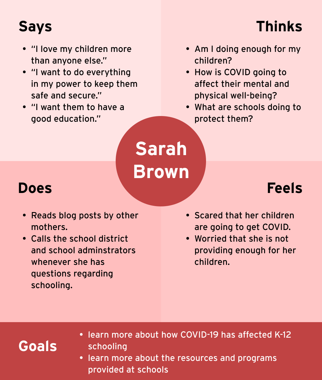
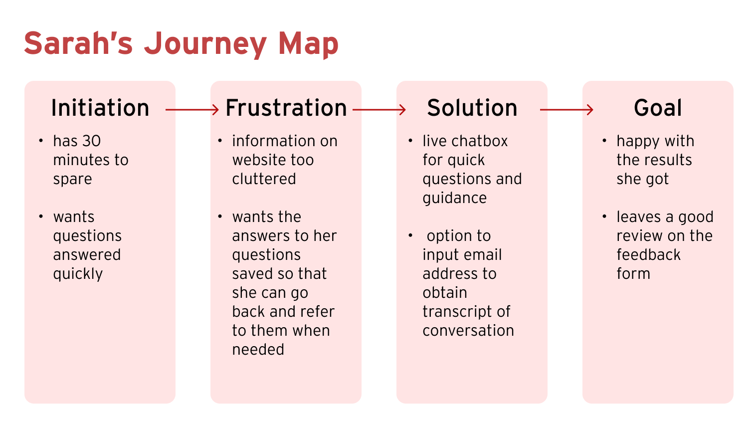
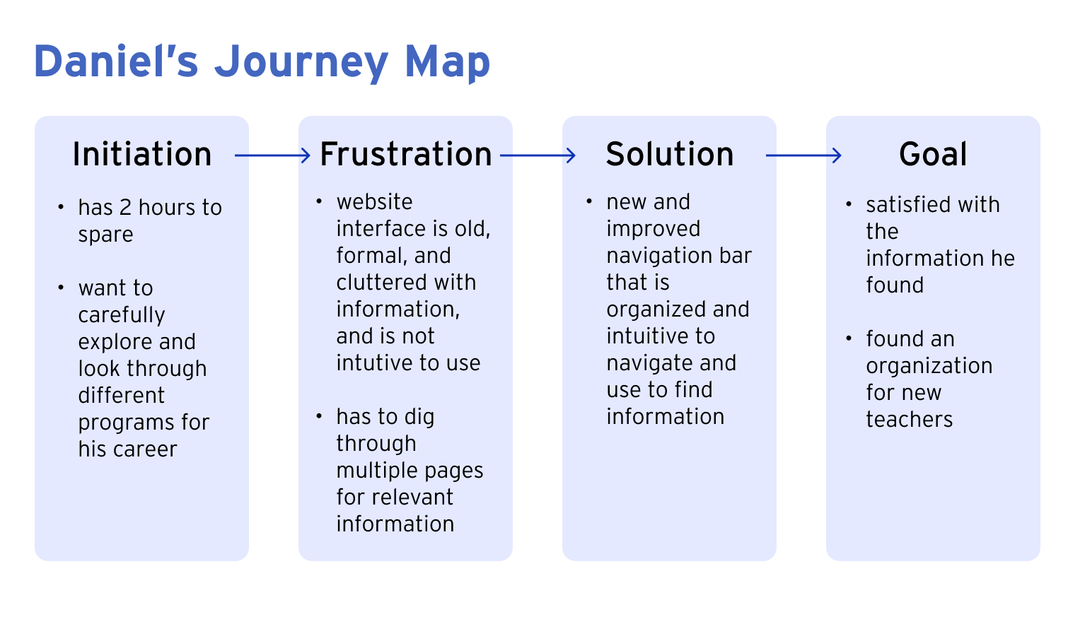
Next, I created 2 personas and empathy maps and came up with scenarios and journey maps in order to
understand the users from their perspectives and see how they view the world,
recognize target users' behaviors, pain points, goals, challenges, and more, and
create designs that focus on users' needs through creating and analyzing personas in detail. Through this process, I understood what user-centered design means and how to take into consideration my users' needs and wants when interacting with an application.
Find the link to the full documentation of the UX storytelling here.


Low-Fi Prototype
After conducting user research and gaining a greater understanding of the product/service I was working on for the project, I finally started designing the actual app. I decided that the two main features I wanted to improve and/implement were
A live chatbox which users can utilize to get assistance on finding information and
a streamlined appointment booking process.
I first started by sketching wireframes and drawing wireflows.
Next, I conducted a low-fidelity prototype test by asking a participant to connect the wireframes that I created and I screen recorded the process. I guided her to try out the features and complete the tasks. She talked out loud throughout the process and noted the places where she was confused. The video can be found here.
Afterwards, I made changes accordingly and created a digitized wireflow and low-fidelity prototype. Here is the link to the digitized low-fidelity prototype.
Find the link to the full documentation of the wireframes and low-fidelity prototype here.
Interface Design
After creating the low-fidelity prototype, I started on the interface design. I tested out different typefaces and fonts, shapes, as well as colors. I also took into consideration accessibility, particularly color contrast. All of these were done on the homepage. The homepage is the most important page as it sets the tone for the rest of the website. Here is the link to the figma file with the design variations (each section is on a different page).
Impression test
The impression test was conducted near the end of the interface design process. "Looks cohesive...Simple. It looks like there's a lot of blank space here (pointing at the area underneath search bar). But much better than the current one..."
I asked my participant to compare the homepage I designed with the original homepage. Overall, they told me that they liked my design and that it looked simple and clean. However, they said that they would like it if there was a short description of what the Department of Education of Nevada does. They thought that I could add a little bit more information about it. They also pointed out that it looked a little empty. I will be making changes based on what they said and I will be implementing them. For my final screens, I will be making it so that the page can be scrolled and more information can be obtained.
Find the link to the full documentation of the interface design here.
Hi-Fi Prototype
After creating the low-fidelity prototype and testing out different interface designs, I started the interactive prototype process. The purpose of this is to better visualize the functions of various features I wish to implement. Below is the final version of the high-fidelity prototype, which has gone through multiple rounds of iterations to reflect the feedback and comments given from others.
Revisions
Cognitive walkthrough
The main feedback I got when I conducted the in-class cognitive walkthrough was for the chatbox feature. I showed my tester my wireframes as well as my interface design and told them to look through the screens and make comments. My participant noted one very important point, which was that when users want to use the chatbox feature, they want their questions answered as soon as possible. I had initially done it so that users would have to input their contact information and choose a topic before they are brought to the chatbox. Hence, I decided to delete these steps and add some possible topics on the first chatbox screen.
Comments from in-class cognitive walkthough activity, 11/16/2021:
"...result of clicking student/ parent/ educator buttons not clear..."
"...icons make it pretty clear where to click..."
"...user might want minimal steps between clicking chat button and actually getting to the chat room..."
Usability testing
I conducted usability testing with 3 participants after creating the high-fidelity prototype. The purpose of the usability testing was to catch any mistakes I made or to see if any areas needed to be improved upon. I asked them to complete two tasks:
Chatbox - Suppose that you are a mother of 2 elementary school students. You want to find more information on how schools are dealing with COVID. a. Open chat box feature. b. Ask question on COVID-19 safety measures schools are taking. c. Fill out the feedback form after you're done chatting.
Book an appointment - Suppose that you are a Nevada public high school teacher. You need to renew your teaching license. a. Schedule an appointment to do so.
The following are the 3 videos of the usability tests I carried out.
Insights from usability testing
All of my participants were able to complete the two tasks quickly and easily. They expressed that the app was straightforward, clear, and easy to use. They also picked up on some areas where I made mistakes and made suggestions on things they thought could be improved on.
Search bar on homepage
They noted that the search bar on the homepage decreased the trustworthiness of app as it looked "scammy", or looked like a search bar that would appear on a website where scams happened. Hence, I changed the design of the search bar.
COVID information tab
They noted that the tab that pop ups looked scrollable as the grey box was extended all the way down to the end of the page. So I fixed it so that the grey box did not extend all the way.
They also noted that when the tab is closed, it goes back to the initial chat box page. This was a prototyping issue and I figured out that instead of choosing "Back" for the interaction, I had to choose "Close overlay" so that users would be brought back to the previous page.
Select location page
They were confused when selecting the locations while doing task #2 which was to book an appointment. I should have clarified that only one location was to be selected. I fixed this by adding a text underneath the title.
They also suggested that I add visual dividers to the different locations so users can see individual data more clearly.
Reflection
This was my first UX/UI design project where I designed a mobile web app using a user-centered design process. It was a fulfilling process and I have learned a lot about the fundamentals of UX/UI Design. It was great learning how to conduct user research interviews and contextual inquiries, creating personas and scenarios, as well as using prototyping tools like Figma and more. There is a lot I can take away from this project and if I continue practicing the skills I picked up, I believe it could be an invaluable asset to my future career in UX/UI Design.
Along the way, I had to continuously make revisions to my design based on feedback from my peers. I learned to listen to people's opinions and ideas, understand users' needs, challenges and pain points, and learned how to take those to make good user-centered design. I also learned that being open minded and being open to different ideas and suggestions is extremely important in creating good design.
If I had more time and resources, I would love to implement or change the following:
Conduct user testing and interviews on people from my target user group. As I did not personally know many parents, K-12 educators, or people from Nevada in general, I conducted my contextual inquiry on someone who only loosely fit the target user group.
Conduct usability testing on target users. The participants for my usability testing were mostly all college-aged students. It would have been better if they were actual potential users of the app.
Add more information and features on the app. Currently, I only worked on two features, which are the chat box and booking an appointment for educators. It would be great if I could add more features for the other users like students and administrators.


